Exciting news - We're Moving!

On the 26th of September we will be moving from our shop at 33 Walcot Street, to our new Printworks premises at 134 Walcot Street. 
Our products and bespoke orders will then be produced entirely in house, everything from the design and printing of our letterpress stationery to the wax seals we apply to our own brand box sets. We are extremely excited to have everything in one building, with the focus on our own brand  products, which will be available for purchase at 134, together with some of our other favourite stationery items and accessories. 
Customers will, of course, still be able to peruse samples of our bespoke stationery here, and place their orders with us in store, with the additional possibility of watching their stationery being printed. 

We started Meticulous Ink at number 33 back in 2010 and it's been a whirlwind of activity ever since, from printing downstairs in our shop on a Model No.4 table top press, to printing hundreds and thousands of pieces of stationery for all to see on our Heidelberg windmill presses at 134 Walcot Street.

This Saturday at 33 Walcot Street we will be having a sale on selected goods in store - Rifle Paper cards and accessories, Invite. L leather goods and stationery, Prior books, Original Crown Mill and a few of our own brand products.

We look forward to welcoming you into our new store very soon.

- Charlie & Athena 


The Lost Art of Hand Lettering


The word calligraphy comes from Ancient Greek κάλλος kallos meaning  "beauty" and γραφή graphẽ  meaning “writing”. 

I remember receiving my first hand lettered envelope and being unable to comprehend that somebody had written the address by hand. The fluid curves of the letters, the opaque white ink jumping off of a scarlet envelope, the sheer neatness of each individual letter, all struck me so deeply that I have kept that envelope and it sits besides me now as I type this blog post. 

Athena hard at work hand lettering

Calligraphy has become a significant part of the day to day business of Meticulous Ink. We have always incorporated hand lettering in our letterpress designs, and our unique and playful stye has become ubiquitous of Meticulous Ink. In the summer of 2013 we began offering the service of hand lettered addresses, starting with a commission of sparkling gold ink on ivory envelopes. We have now completed calligraphed addresses in everything from egg yolk yellow on brown kraft, to deep aubergine on olive green. There is nothing more exciting than experimenting with colour and style when it comes to addressing an envelope.

Handmade Cool Blue envelopes with bright pink calligraphy

We will be holding our first hand lettering workshop in store on the evening of Wednesday, 6th August, where Suzie, our calligraphy expert will guide you through an introduction to hand lettering. The workshop runs from 6pm to 8pm and will include a hand painted dip pen, nib, a pot of our own Iron Gall ink, along with a Guide to Hand Lettering and a letterpress calligraphy practice pad; all to take home after the workshop. The workshop costs £75.00 and spaces are limited, so please contact us to book your place: (01225) 333004

Hairy Manilla envelopes with egg yolk yellow ink

Meishi


In Japan the act of exchanging a business card is a ritualistic tradition. A Japanese business card is called a meishi; translated mei means name and shi thorn; traditionally the cards would have been hand carved using sharp splinters of bamboo. When the card is presented it is held in the top two corners, face up and turned so the person receiving the meishi can read the card; the meishi should be received and held in the bottom two corners, it is considered impolite to cover the name with ones thumb. Once the card has been read one must thank the person and bow.

This concept is very foreign to us in the UK; all too often a creased, digitally printed card is pulled from ones pocket and immediately stuffed into a wallet without a second glance. Our belief is that a business card is the first physical impression of you and your business. Everything from the weight of the paper, the texture of the print and the typesetting of the text all lead to a lasting impression that is formed of you.

"Look at that subtle colouring. The tasteful thickness... oh my God. It even has a watermark.” 
Patrick Bateman, American Psycho, 2000.

Letterpress printed onto Cairn recycled board


Metallic die-stamping and light blue letterpress on Colorplan Mist 540gsm

Grey letterpress on Colorplan cool grey 350gsm.

On the press: Grey letterpress onto pristine white Colorplan


A Window into our Soul

Our new print works are shortly opening on Walcot Street, Bath.

From our conception in a dusty old shed in Dorset, to a windowless industrial unit on the outskirts of Bath, the time has finally come to move the printing machines to pride of place in their own stand alone store on Walcot Street, Bath.

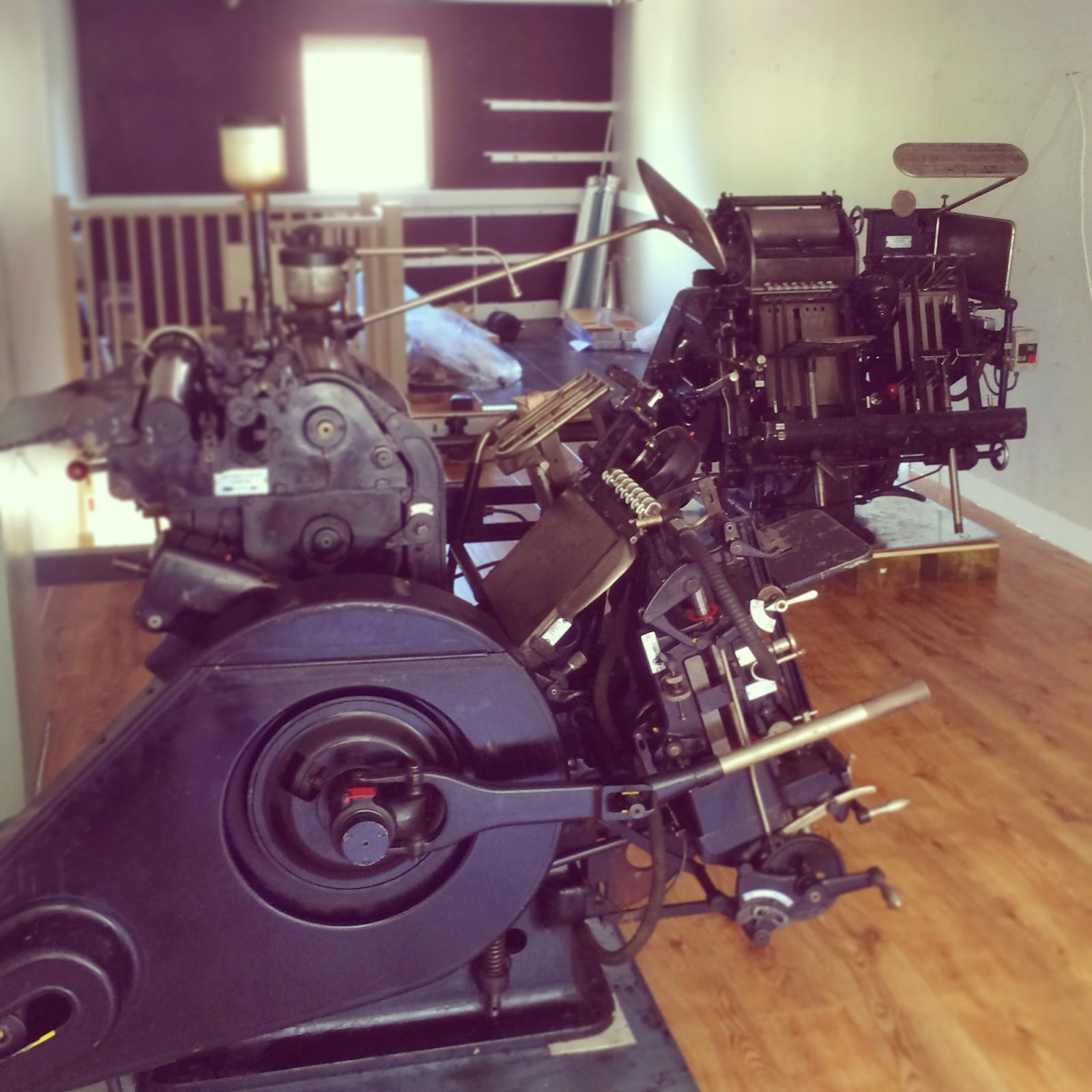
We print using two beautiful Heidelberg 10x15 Platens dating from the 1960’s and everything from their windmill like motion, whooshing and whirring as they print, to their physical beauty (1 ton of elegant German engineered black steel, wielding 40 tons of pressure); are a pleasure  to behold.

So, one day, very soon, as you are walking down Walcot Street, why not cast your gaze upon no. 134 and witness for yourself what really goes into 
making a meticulous letterpress print. 

Formerly opening on Saturday, 14th June 2014.

Being loaded onto the truck before being transported across Bath.
Charlie meticulously cleaning the machine parts before reassembling .

The machines in their new home, 134 Walcot Street, Bath


A 1920's Nod - Wedding Stationery, Alex & Peter

This clean, 1920's themed invitation took inspiration from the deco style railings that surround the building in which the lovely Alex and Peter were getting married. We incorporated the bold geometric design of the railings into the wedding stationery suite by blind letterpress printing it onto the soft 600gsm 100% cotton Cranes Lettra board. 
This subtle technique of Letterpress printing without ink is not only pleasing to the eye but creates a tactile pleasure too. A mix of typefaces all with a nod to the twenties come together to create this elegant invitation.


As well as the main invitation, we designed and printed the pre-wedding dinner invite, information sheet and the rather pleasing envelopes that were handmade using Cranes Lettra paper before being litho printed in 2 colours. For the day we created a matching welcome print and table plan.


And, we are sure now that Downton has hit the roaring twenties, this invitation would even be fit for Lady Mary Crawley  if she ever decides to accept her proposal from Lord Gillingham (fingers crossed!)

3 Wonderful Years!

Today is our 3rd Birthday! (the 23rd of October)

It's been non stop since we first opened our doors here on Walcot street, and the weeks have been flying past. We've gone from printing bespoke stationery on our small table top presses to reeling off hundreds of prints at a time in our new print works in Oldfield Park.

A few of our letterpress greeting cards.

The shop is still busy as always, and we will shortly be undertaking a small shop refit to allow us to stock more of our favourite goods and so that we can fit in the increasing amount of our own products. It's taken a while for us to fit in designing more of our own goods, but thanks to new team members Suzie and Zoë we have been able to design more products, release our first catalogue for wholesale and even send out our first wholesale order to a shop in Singapore - we've gone international!
In January we will be partaking in our first trade show for our own brand paper goods, at Top Drawer in London - the next step for Meticulous Ink.

The Meticulous Ink Team, Athena, Charlie, Suzie and Zoë.

We continue to enjoy producing private bespoke stationery for our customers from our lovely shop in Bath, and have seen an incredibly busy year. We have had the pleasure of designing many beautiful wedding stationery suites for many happy couples, as well as helping companies develop their branding into something we would be proud of ourselves.

Our 2014 letterpress calendar, available in store from November.

Our platens haven't seen a dull moment, both printing away into the night on new box sets, christmas cards and our first calendar for 2014.
We are currently designing many more products and expect to bring you more lovely paper goods next year. In addition to this we have been slowly phasing in our new branding which will be in full effect by January.

Here's to another glorious year!

A sneak peek of our updated Meticulous Ink logo.

Letterpress Wedding Stationery - Gemma & Samuel.

Some pretty summer wedding invitation inspiration for you today, a classic English country wedding.

Gemma and Samuel took full advantage of the bespoke nature of our invitations and requested an illustrated border containing various items that really meant something to them - hot air balloons, daisies, roses, a rugby ball and knitting needles amongst other things. This illustrated border perfectly framed classically typeset information for the big day.
They chose pretty soft summer colours - a soft yellow and dusty blue, to be printed on to a beautifully thick 535gsm Bockingford board - a board that we often use for printing as it performs so well with letterpress.

We also provided them with matching day stationery - an order of service - with matching colours, ribboned in bright yellow. Scattered throughout the pages of the order of service, more illustrations we created of items that meant something to them. This idea really brings together a truly personal feel to the whole wedding suite, and something that is now a very popular style for us.
For their wedding favours, they made small pots of jam for their guests - so we provided them with a pretty jam jar label to match the rest of their stationery.

Stationery photography by Benkin Photography.

Letterpress wedding invitations and matching digitally printed order of service booklets.
 
Their favourite things, letterpress printed onto 535gsm Bockingford board.

More meaningful illustrations, scattered throughout this pretty order of service.


The big day and the happy couple, both looking wonderful.

Croquet celebrations and homemade jam.
And then there was cake, beautiful cake.